Fresh arrivals, limited quantities.
Loading cart…
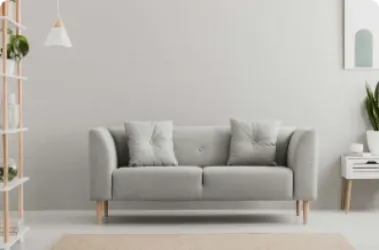
Standing in a paint shop faced with hundreds of colour swatches, most homeowners freeze. The stakes feel high — paint the whole living room and live with it for years — and the choices feel infinite. Yet professional interior designers make colour decisions with confidence and ease. The difference is not talent; it is method. Once you understand a few fundamental principles, colour selection becomes straightforward.
The most reliable starting point for any colour palette is an object you already own and love: a rug, a piece of artwork, a favourite set of cushions, a ceramic vase. These objects already contain a harmonious combination of colours — that is why you were drawn to them in the first place. Use an eyedropper tool on your phone to sample the colours from a photo of that object, then build your palette from there.
This classic interior design principle gives structure to colour decisions in any room:
Applied consistently, this rule creates rooms that feel balanced and intentional — never either too flat or too chaotic.
This is the most important practical advice in this entire guide. Never paint a whole room based on a small colour swatch. Paint a section of wall at least A3 size — ideally half a metre square — and live with it for three to five days. Observe how the colour looks in the morning light, in the afternoon, and in the evening under artificial light. Colours change dramatically under different conditions. A warm terracotta that looks inviting in the afternoon can appear harsh under cool LED lights in the evening.
Some of the most beautiful and timeless colour palettes available to a Kenyan homeowner come directly from the landscape:
These colours feel grounded and right in a Kenyan home in a way that imported trend colours often do not. They connect your interior to the landscape outside your windows.
Every paint colour has an undertone — a subtle secondary colour that emerges in certain lighting conditions. A white wall may have pink, yellow, blue or green undertones that only become apparent once painted. Always look at a paint colour against your existing furniture and flooring before committing. A white with warm yellow undertones will clash with cool grey furniture; a white with blue undertones will feel cold against warm wood tones.
Many Nairobi apartments have limited natural light — north-facing rooms, rooms surrounded by other buildings, or rooms with small windows. The instinct is often to paint them white to brighten them up, but a brilliant white in a dark room actually makes the darkness more apparent by emphasising shadows. Instead, use a warm off-white or a warm mid-tone colour — soft terracotta, warm beige, light sage — which reflects light gently and makes the room feel cosy rather than cold and dark.
A single bold feature wall can add drama and define a space without committing to a full room repaint. The key is choosing the right wall — typically the one facing the entrance to the room, or the wall behind the bed in a bedroom. Keep the other three walls in a neutral tone that complements the feature colour. The feature wall should be bold enough to make an impact but share at least one colour family with the rest of the room's decor.


Comments (4)
Grace Wambua
February 06, 2026Thank you for the eco-friendly homes article. We installed a rainwater harvesting system last year and it has genuinely been life-changing, especially during the dry season.
Leave A Comment